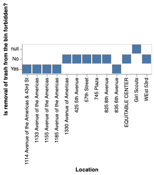
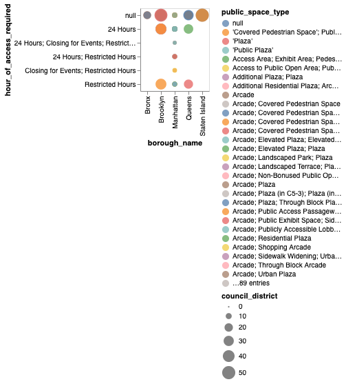
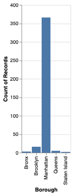
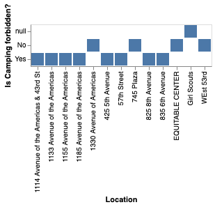
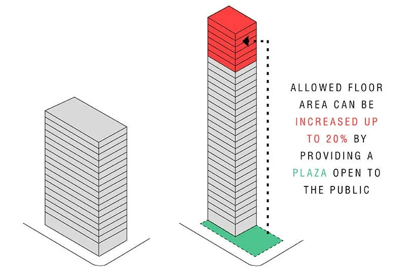
I created a chart to show the amount of floor space that buildings had in relation to the size of the POPS they provided to the city to try and visualise the disparity between private and public space, and how the developers were essentially commodifying public space in ordr to gain more private space. I wondered if I could visualise how much public space is worth in comparison to private space.
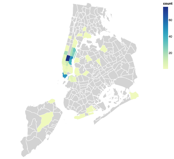
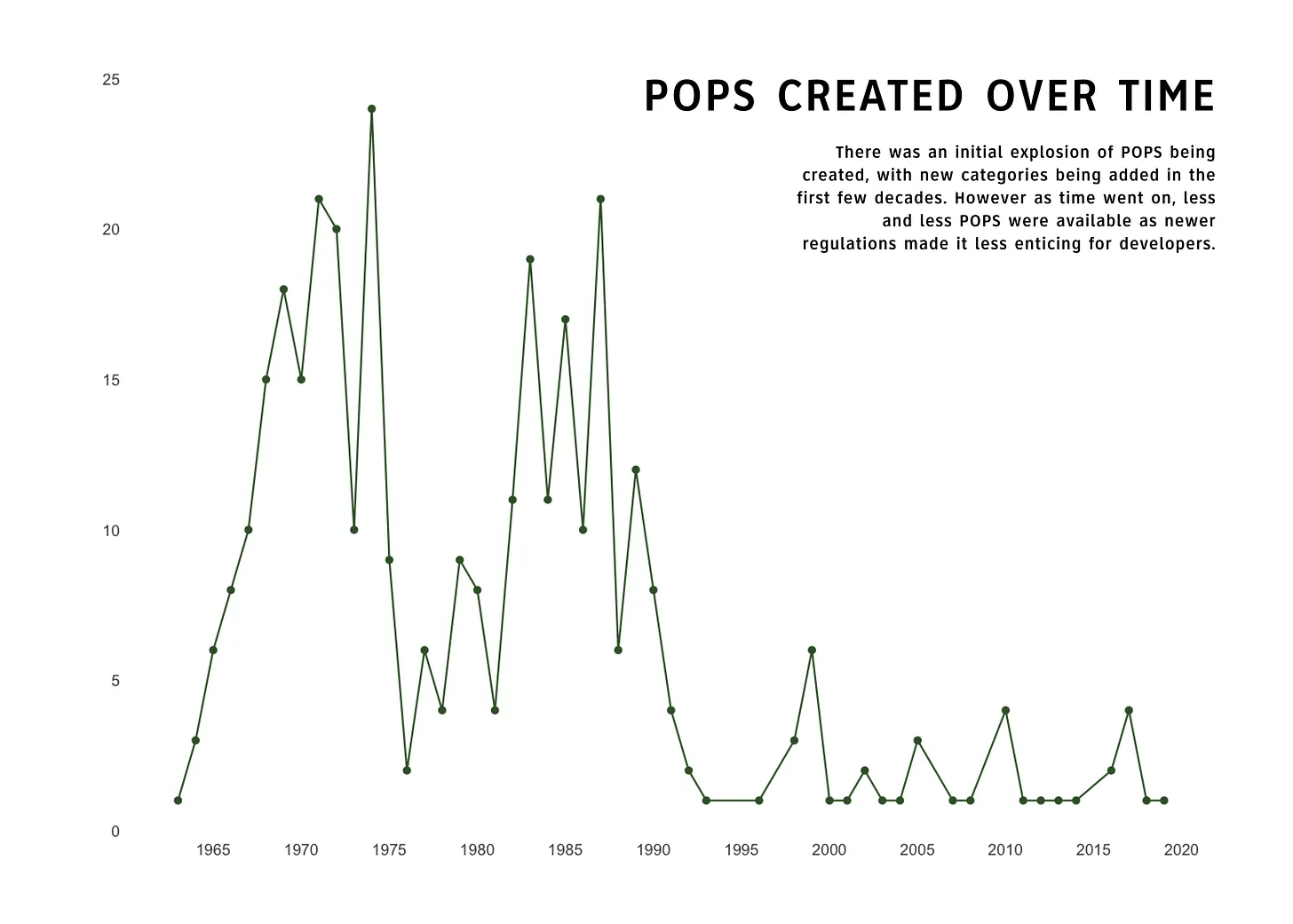
Past data iterations
I was trying to code data in Colab but I knew that the visualisations weren't conveying the information I was trying to communicate, which was the pervasive sense of unease which are apparent in the POPS, what it feels like to be in a space that is both public and private.
I cycle around the city.